Lost in Digital: 10 Ways to Reclaim Your Brand Identity
Editor’s note:
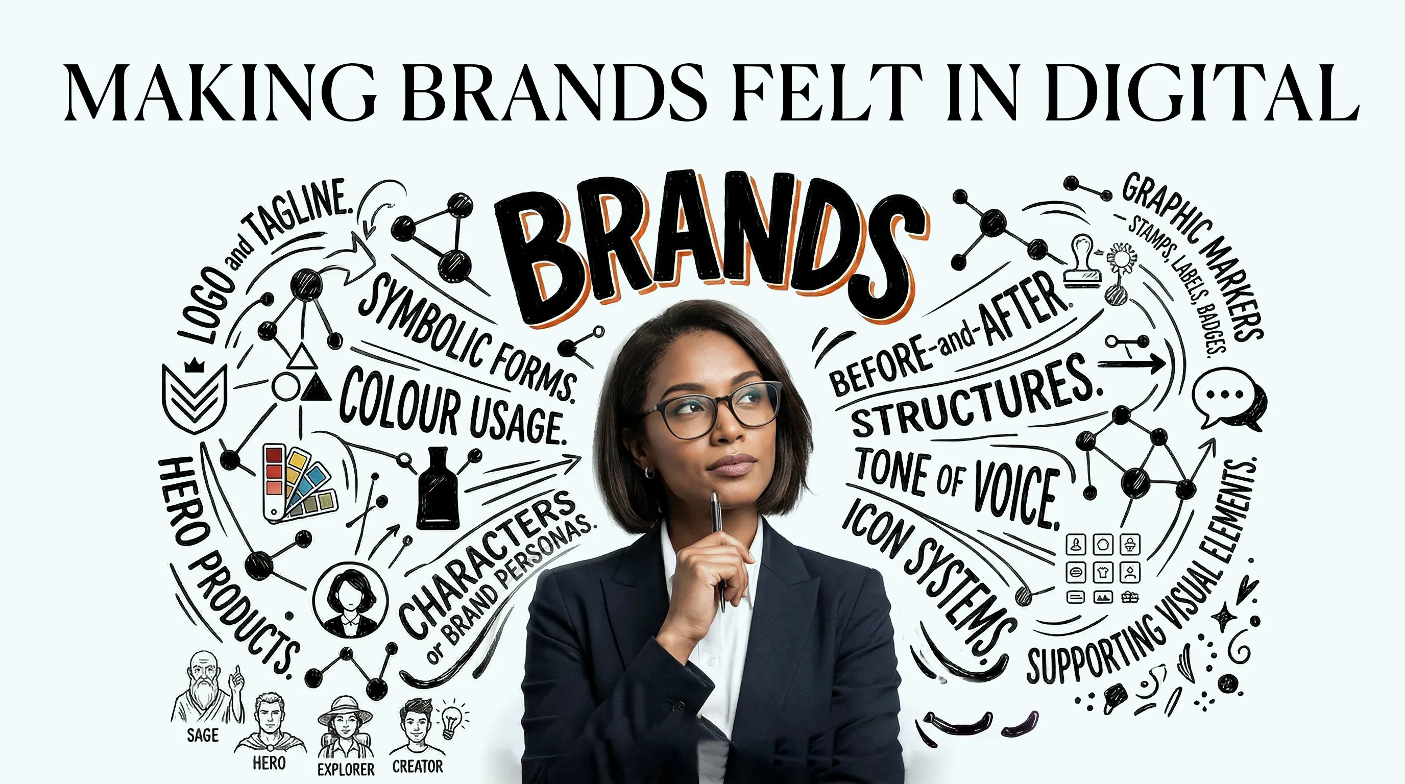
The more a brand produces, the less recognizable it often becomes. In digital, it’s easy to be everywhere — and still feel like no one.
RISEON was working with a Korean beauty brand not long ago. Step into one of their stores and everything feels considered — the lighting, the materials, the way products are arranged, even the rhythm of how you move through the space. You understand, almost instinctively, what this brand stands for. Then you encounter the same brand online. The e-commerce is efficient. Social content is active. Short-form videos follow familiar formats. Everything appears correct, even competent. And yet something has slipped. You can see what is being sold. But you don’t quite sense who is speaking.
This is what it looks like when a brand loses itself in digital. Not through bad work — but through too much of it, moving too fast, without a clear enough centre to return to. And in the age of AI, where content can be generated endlessly, this kind of drift is becoming the defining challenge of brand-building.
The good news: identity isn’t lost. It just needs to be reclaimed.
Why Brands Lose Themselves in Digital
It rarely happens all at once. A brand doesn’t wake up one day and decide to lose its identity. It drifts — post by post, campaign by campaign — until the pieces no longer feel connected.
AI has accelerated this. It’s now remarkably easy to generate visuals, write copy, and produce video at scale. But speed doesn’t come with judgment. Without a clearly defined centre, more content simply means more variation — and variation, over time, is the enemy of recognition.
The brands that resist this drift are not the ones producing less. They’re the ones anchored to more. LEGO returns, in everything it does, to a single idea: creativity. Nike never strays far from movement, effort, and personal drive. Their digital presence doesn’t feel like an adaptation to new channels — it feels like a continuation of something that was already there. You know them not because they remind you, but because you’ve felt them enough times to remember.
That’s what a strong brand system does. It doesn’t constrain what you produce — it gives everything you produce somewhere to belong.
These are the 10 elements that form that system.
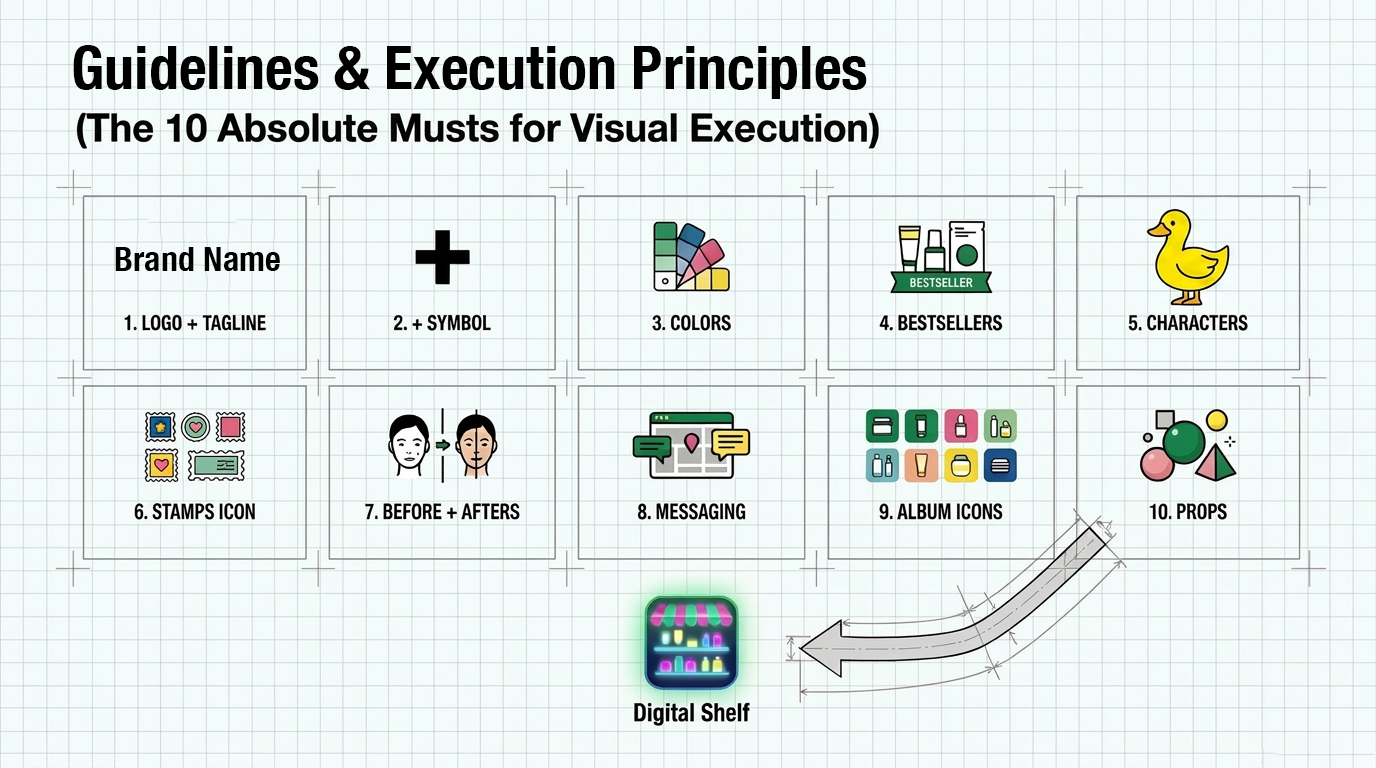
The 10 Absolute Musts for Visual Execution on the Digital Shelf
1. Logo + Tagline Your logo is not just a mark — it’s an anchor. Every piece of content needs a consistent logic for how the logo appears: its size, its placement, its relationship to other elements. The tagline, when used, should reinforce the brand’s core idea, not describe what you sell.
2. Symbol Beyond the logo, strong brands own a shape. A recurring graphic element — a cross, a curve, a distinctive form — that travels across contexts without explanation. When someone can recognize your brand from a shape alone, you have built something real.
3. Colors Color is the fastest signal a brand has. A disciplined palette — not just a primary color, but a system of combinations — makes content instantly attributable. The goal is not variety, but recognition. Limit your colors and use them with intention.
4. Bestsellers Your hero products are brand assets. Featuring them consistently across digital touchpoints does more than drive conversion — it builds a visual vocabulary that customers begin to associate with you. Familiarity is trust.
5. Characters Characters — whether human, illustrated, or mascot-like — carry tone in ways that copy and color cannot. They personalize the brand and give it a voice that persists across formats. In a feed full of product shots, a recognizable character stops the scroll.
6. Stamps & Icons Graphic devices like stamps, badges, and custom icons create texture and ownership. They signal craft. Used consistently, they become part of the brand’s visual fingerprint — details that loyal customers notice, even if they can’t articulate why.
7. Before + Afters Transformation is one of the most powerful narrative structures in beauty and eCommerce. But a before-and-after is not just a format — it’s a repeatable proof of value. When used consistently, it becomes a brand signature, not just a content type.
8. Messaging Voice is a visual element. The words you choose, the rhythm of your sentences, the level of warmth or authority in your tone — these are as distinctive as your color palette. Consistent messaging means every caption, every headline, every call-to-action feels like it came from the same place.
9. Album Icons In a world where customers browse product grids, category icons, and app interfaces, a cohesive icon system is the difference between a brand that feels considered and one that feels assembled. Album icons — the small visuals that organize your product world — should feel unmistakably yours.
10. Props & Visual World The objects, textures, surfaces, and environments that appear alongside your products define the world your brand inhabits. A consistent visual world — materials, lighting, spatial feeling — is what separates a brand that feels like a place from a brand that feels like a catalogue.
The Way Back
Your brand exists across a sequence now — product pages, social feeds, short videos, ads, search results. Customers don’t experience it in one place. They piece it together across dozens of moments. And in each of those moments, your brand either feels like itself, or it doesn’t.
Here is a simple test: remove your logo from ten pieces of recent content and look again. If the brand still holds — in color, in tone, in feeling — you have found your way back. If it doesn’t, you have a production habit, not an identity.
These ten elements won’t rebuild a brand overnight. But used consistently, they give everything you produce somewhere to belong — until recognition no longer depends on a logo, a tagline, or an explicit signal. Just familiarity. Just feeling.
In a world where anything can be generated instantly, what gets lost is easy to replace. What gets felt is not.
Got value from this article?
Share the insight with your network.


.avif)